Business Cards: What’s hot and what’s not?
April 21, 2019 / /

At our meeting this month, we reviewed a number of business cards from our personal collections and discussed what we liked and disliked about each.
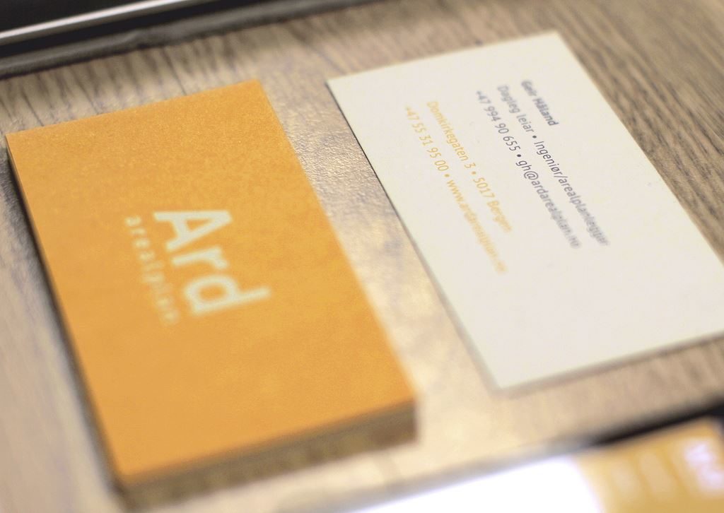
Several trends stood out as we identified the cards we found most appealing:
- Heavier than usual card stock
- Rounded corners
- Large logo on one side of card with contact information and small logo on the other
- Bold colours
Attributes we found offputting included:
- Flimsy card stock
- Obviously amateur design
- Fonts too small to read
- Not enough contrast between text and background, making it difficult to read
- Nothing to identify the nature of the business
- Super traditional (i.e. boring) design and layout
- Irrelevant graphics
- Too much information included
Have you looked at your own business card lately? How well does it represent you and your business?
“Ard arealplan – Business card” by Jørgen Håland is licensed under CC by 2.0.
Posted in Business Tips, Meeting Notes

I came across this article on Speckyboy.com that has some great examples of current business card designs.